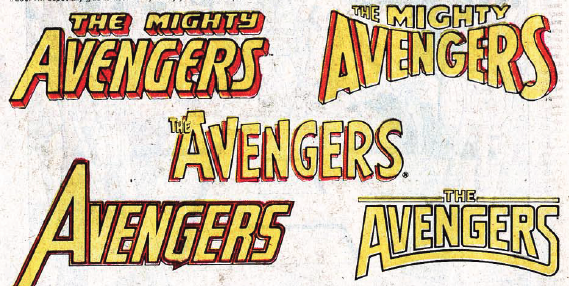
From Avengers #300 (1989), a compilation of all the logos the book had ever had by that point:
I'll confess, I'm partial to the one on the lower left, but I'll also admit that it's entirely nostalgia--that's the logo the book use when I started buying it. So it's sort of been adopted in my head as "mine."
Your mileage may vary, of course...
6 comments:
I can tell you my least favorite--the upper left, using a style that could be plugged into practically any other title (and was, with slight variations). The one on the upper right never really grabbed me, either--if memory serves, it only lasted a few issues before being retired.
I think I like the one on the lower right mostly because it heads most of the Stern/Buscema issues that I'm fond of.
The lower right one will always remain "my" Avengers logo, getting into the series right as the fourth Masters of Evil set upon the Mansion ("Jarvis Fights Alone!")
The one in the middle was the one used when I started buying books. The very first comic I bought with my own money was a Roy Thomas Avengers.
I never liked the addition of "Mighty" to the logo. It seemed cheap. I think it was a subconscious association I made with The Mighty Crusaders, which I detested.
For the record, "my" logo is the one in the center, which was on the first issue I bought, Avengers #25. The one on the lower left is the best design, very dynamic and slick.
I remember a fan (I don't recall any sort of contest) designed the top left version, but I don't recall him using MIGHTY in the logo. I have no idea why I remember that, but I do.
I'm partial to the lower left one as well, but I prefer mine with the little arrow incorporated into the "A," ideally with "the" inside the arrow.
Post a Comment